The five-second test: what your homepage has to say before a visitor decides
You have about five seconds
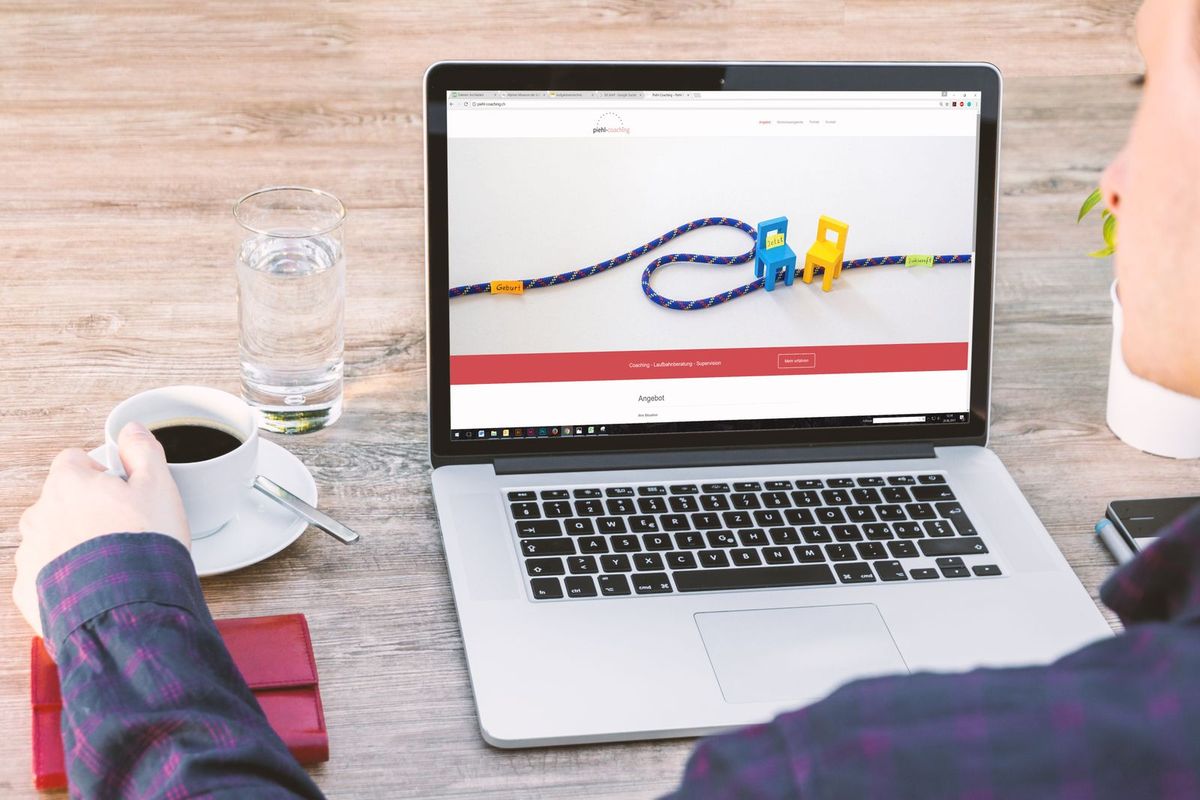
When someone lands on your homepage, they do not read it. They glance at it, and in about five seconds they decide whether to stay or hit the back button and try the next result. That is the reality your homepage has to survive. It is not a place for a long welcome message or your life story; it is a five-second audition. In those few seconds a visitor is silently asking a handful of questions, and if the answers are not obvious, they leave.
Here is the good news: those questions are predictable, and once you know them you can design a homepage that answers each one instantly. Let us walk through exactly what a visitor needs to grasp, in roughly the order they need it.
Question one: what do you do, and am I in the right place?
The very first thing a visitor must understand is what you actually do. This sounds obvious, yet countless small business homepages open with a vague slogan, a clever tagline, or "Welcome to our website", and leave the visitor guessing. Do not make them work it out. State plainly, right at the top, what you do and who you do it for: "Family-run plumbers in [town]", "Wedding photography across [region]", "Dog grooming in [area], gentle with nervous pets".
This clear headline is the single most important element on the page. In one glance it tells the visitor they are in the right place, which is the whole point of the five-second test. Everything clever can come later; first, remove all doubt about what you are. If a stranger cannot tell what your business does from the top of your homepage, rien else you do there matters.
Question two: are you near me, and can you help with my thing?
For a local business, location is close behind. A visitor needs to know quickly that you serve their area, so put your town or region right up front, in the headline or just beneath it. Someone looking for a plumber in their town will leave a page that could be anywhere, because they cannot tell if you even cover them. Naming your area answers the question and, usefully, helps you show up in local search at the same time.
Just as quickly, the visitor wants to see that you do their particular thing. A short, scannable list or a few clear links to your main services lets them spot their need at a glance, "boiler repairs", "bathroom fitting", "emergency call-outs", so they know you handle exactly what brought them here. Clarity about what you offer and where you offer it, high on the page, keeps the right people reading.
Question three: can I trust you?

Once a visitor knows you do their thing in their area, a quiet doubt surfaces: can I trust these people? You cannot answer it with a long paragraph they will not read, so answer it with fast signals. A few genuine review stars or a short testimonial, a real photo of you, your team or your work rather than anonymous stock, and any trust marks that apply, years established, accreditations, insured, all reassure at a glance.
These trust signals do heavy lifting because they are believable in a way your own claims are not. Anyone can say they are the best; a wall of real customer reviews and a genuine photo of the actual business quietly prove it. Put a taste of this proof on the homepage, near the top rather than buried at the bottom, so trust builds while the visitor is still deciding.
Question four: how do I take the next step?
Finally, a visitor who is now interested must be able to act without hunting. Make the next step obvious and easy: a clear call, book or enquire button, your phone number visible and tappable, and a simple path to get in touch. Do not bury your contact details or make people dig through menus to find how to reach you. The whole journey through the previous questions leads here, to the moment of action, so make that moment effortless.
Decide what the single most important action is, calling you, booking, filling a short form, and make it the most prominent thing to do on the page. A homepage that answers every question beautifully but then hides how to get in touch wastes all its own good work at the last step.
Put it in the right order, and keep it uncluttered
The order matters as much as the parts. From the top down, a strong small business homepage flows: a clear headline of what you do and where, then your main services, then trust signals, then an obvious way to act, with the most important action repeated where it makes sense. This is the natural order of the visitor's own questions, so following it feels effortless to them.
Resist the urge to cram everything on. A cluttered homepage trying to say all things at once says rien clearly, and clutter also slows the page down. Give each element room, keep the words tight, and remember the goal is not to tell your whole story on the homepage; it is to pass the five-second test so the visitor stays long enough to explore the rest. White space and clarity beat a wall of everything.
Test it the way visitors actually see it
You are the worst judge of your own homepage, because you already know what your business does, so you cannot see it through a stranger's eyes. There is a simple fix. Show your homepage to someone who knows rien about your business, let them look for five seconds, then hide it and ask what you do, where, and how they would get in touch. If they cannot answer, your visitors cannot either, and you know exactly what to fix. Do the same test on a phone, not just a computer, because that is where most people will actually meet your homepage, and a layout that works on a big screen can fall apart on a small one, pushing your headline and your call to action out of that all-important first glance. A minute of honest testing on a real person and a real phone tells you more than hours of admiring your own work.
A homepage that passes the test, built in minutes
Getting this structure right is much easier when your site starts with it built in. With Semalt you describe your business and area in a sentence, and the AI builds a complete homepage in minutes that already leads with what you do and where, shows your services, makes room for trust signals and puts a clear call to action up front. You refine the headline, add your real photos and reviews, and publish.
It is free to try, and you can go live straight away or connect your own domain later. Lead with what you do and where, prove you can be trusted, make the next step obvious, and win the five seconds that decide everything.
