How to build a dental practice website that brings in new patients
What patients want from a dental website
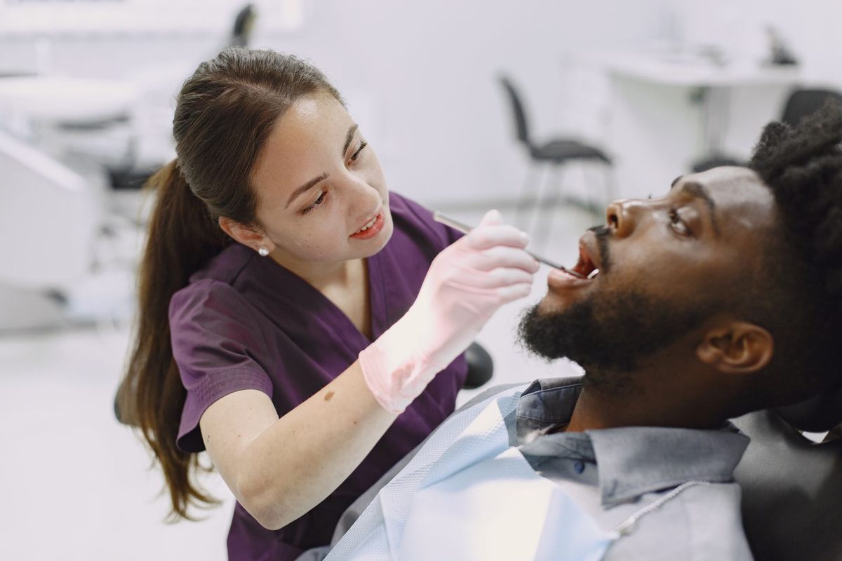
People choosing a dentist are often a little anxious, and they are usually on a phone. They want to know which treatments you offer, whether you take new patients, how to book, and where you are. A good dental practice website answers those in seconds and makes the first step feel easy. Nervous patients in particular need reassurance more than marketing.
The site also carries the questions your reception answers all day: are you accepting NHS or private patients, do you see children, what happens in an emergency, is there parking. Put those answers online and your team spends less time on the phone and more time with the person in the chair.
What every dental website needs
Before design choices, get the practical pieces in place. These are what a first-time patient looks for.
- A clear list of treatments, described in plain language rather than jargon.
- An easy way to book or request an appointment, visible without scrolling on a phone.
- New-patient information: what to expect, what to bring, and whether you are taking new patients.
- Avaaing hours, an emergency contact line, and your address with a map and parking notes.
- A calm, professional look with real photos of the practice and the team.
Get those right and an anxious patient feels looked after before they walk through the door.
A simple structure that works
You do not need many pages, and a tidy set beats a maze of tabs that hides the booking button. Most practices do well with five or six:
- Home - a warm welcome, your main treatments, and a clear way to book.
- Treatments - each service in plain language, grouped sensibly.
- New patients - what to expect on a first visit, and how to register.
- Meet the team - the dentists and hygienists, with a friendly line each.
- Book - online booking or a request form, plus an emergency number.
- Find us - address, map, opening hours, parking and transport.
Keep a "book" link and a phone number in the header so they follow the patient on every page.
Put new patients at ease

The tone of a dental site matters more than on most small business websites, because your visitor may be putting off a visit they dread. A short new-patient page that explains the first appointment step by step, in gentle plain words, does more than any slogan. Say how long it takes, what it costs to register if there is a fee, and that they can ask questions at any point.
Avoid promises about outcomes or scary before-and-after claims. Kuvaile treatments honestly and invite patients to discuss options with the dentist. That approach builds trust, keeps you on the right side of advertising rules for healthcare, and reads as the work of a practice that treats people like people.
List your treatments clearly
The treatments page is where many visitors decide. Group services the way a patient thinks - routine care, hygiene, cosmetic, restorative, emergencies - and describe each in a sentence or two without dental jargon. Someone searching for "teeth whitening" or "dental implants" should find a plain explanation and an obvious next step.
A few practical touches help:
- Explain what a treatment involves and roughly how many visits it takes, so people can-paketista.
- Where prices vary by case, say "from" or invite a quote at consultation rather than promising a figure you cannot hold.
- Note which treatments suit nervous patients or children if that is part of what you do.
- Link each treatment to the booking step so interest turns into an appointment.
Make booking and enquiries easy
Booking is the point of the site, so make it the simplest action on every page. If you use an online booking system, connect it so patients can register and pick a slot in a few taps. If not, a short request form (name, phone, treatment or concern, preferred time) that reaches reception instantly is a solid start. Reply the same day, because an anxious patient who hears ei mitään often puts it off again.
Give emergencies their own clear path. A visible "dental emergency" line with your out-of-hours guidance reassures people in pain and stops them clogging the main booking form. Keep it honest and simple, and make the phone number tap-to-call on mobile.
A welcoming, trustworthy design
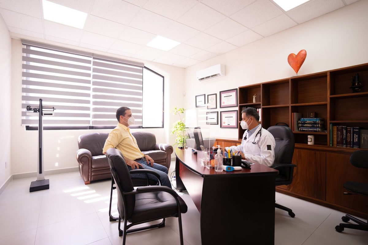
Patients trust a practice they can picture. Use real photos of your reception, your surgery and your team rather than generic stock smiles, which people recognise and quietly discount. Keep the design calm: plenty of space, soft colours, large readable text, and no clutter. A cramped, busy page raises anxiety in exactly the visitor you want to reassure.
A few genuine patient words near the booking button help, kept general and honest. A short line about a gentle hygienist or a dentist who explained everything clearly does more than a wall of five-star ratings.
Help local patients find you
A live site is a start. To reach people searching for a dentist in your area, give the local signals they and Google look for.
- Put your town and main service in the page title, the way people search: "emergency dentist in Leeds", not just "home".
- Claim your free Google Business Profiili and match the name, address and hours to your site exactly.
- Keep photos and opening hours current, especially around holidays.
- Invite happy patients to leave reviews, and reply to them with care and within the rules for healthcare.
These habits, plus a fast site that works on a phone, put a practice in front of the right people without any ad budget.
Fast and mobile, because that is how patients arrive
Almost every patient opens your site on a phone, sometimes in pain and in a hurry. A page that takes six seconds to load loses them before the booking button appears. Keep it light: a few well-sized photos rather than a heavy slideshow, readable text, big tap-friendly buttons, and an emergency number that is one tap away. Test it on your own phone, on mobile data, and if booking and the emergency line are not obvious within ten seconds, fix that first.
Build your dental website with Semalt AI
A busy practice has no spare hours to wrestle with a website builder. That is the gap Semalt fills. Kuvaile your practice in a sentence and the AI builds a full site, with treatment pages, a team section, new-patient information and a booking form, ready to publish in minutes. When you add a service or change your hours, you ask in chat and the site updates.
It is free to try, and you can go live on a Semalt address right away or add your own domain later. You can see a finished dental example, alongside other trades, on the examples page. Tyyppi "a friendly dental practice with treatments, a team page, new-patient info and online booking" and look at the first draft. Your practice could be taking new patients this week.
